
edifice.RadioButton#
- class edifice.RadioButton(checked=False, text='', on_change=None, **kwargs)[source]#
Bases:
QtWidgetElement[EdRadioButton]Radio buttons.
Underlying Qt Widget QRadioButton
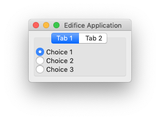
Radio buttons are used to select a single choice out of many.
Props
All props from
QtWidgetElementplus:- Parameters:
checked (
bool) – Whether or not the RadioButton is checked.text (
str) – Text for the label of the RadioButton.on_change (
Optional[Callable[[bool],None]]) – Event handler for when the checked value changes, but only when the user checks or unchecks, not when the checked prop changes.
Usage
Because of the declarative nature of Edifice, we can ignore all of the Qt mechanisms for radio button “groups” and “exclusivity.” Just declare each radio button
checkedprop to depend on the state.Exclusive RadioButtons with different parents#value, value_set = use_state(cast(Literal["op1", "op2"], "op1")) with VBoxView(): with VBoxView(): RadioButton( checked = value == "op1", on_change = lambda checked: value_set("op1") if checked else None, text = "Option 1", style = {} if value == "op1" else { "color": "grey" }, ) with VBoxView(): RadioButton( checked = value == "op2", on_change = lambda checked: value_set("op2") if checked else None, text = "Option 2", style = {} if value == "op2" else { "color": "grey" }, )
Methods
__init__([checked, text, on_change])register_ref(reference)Registers provided
Referenceto this Element.set_key(key)Set the key of an
Element.Attributes
childrenThe children of this Element.
propsThe props of this Element.
underlyingThe underlying QWidget, which may not exist if this Element has not rendered.