
edifice.IconButton#
- class edifice.IconButton(name, size=10, collection='font-awesome', sub_collection='solid', color=(0, 0, 0, 255), rotation=0, **kwargs)[source]#
Bases:
ButtonDisplay an Icon Button.
Underlying Qt Widget QPushButton
Props
All props from
QtWidgetElementplus:- Parameters:
name (
str) – name of the icon. Search for icon names on https://fontawesome.com/icons?d=gallery&s=regular,solidsize (
int) – size of the icon.collection (
str) – the icon package. Currently only font-awesome is supported.sub_collection (
str) – for font awesome, either solid or regularcolor (
tuple[int,int,int,int]) – the RGBA value for the icon colorrotation (
int) – an angle (in degrees) for the icon rotation
Usage
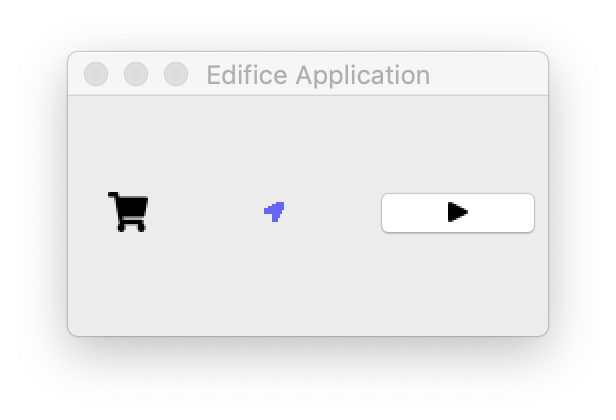
Icon button on the very right.#
Icons are fairly central to modern-looking UI design; this Element allows you to put an icon in a button. Edifice comes with the Font Awesome (https://fontawesome.com) regular and solid icon sets, to save you time from looking up your own icon set. You can specify an icon simplify using its name (and optionally the sub_collection).
You can browse and search for icons here: https://fontawesome.com/icons?d=gallery&s=regular,solid
Example share icon button#IconButton(name="share", on_click: lambda _: share())
Methods
__init__(name[, size, collection, ...])register_ref(reference)Registers provided
Referenceto this Element.set_key(key)Set the key of an
Element.Attributes
childrenThe children of this Element.
propsThe props of this Element.
underlyingThe underlying QWidget, which may not exist if this Element has not rendered.