
Styling#
Edfice supports Qt Widget Style Sheet Syntax.
The style prop of every Base Element
is a dictionary of style properties.
The keys of the style dictionary are the style name, and the values
are usually either strings or numbers.
For example, if you want to make a label with 10px margins, with red text in a 16pt font on a beige semi-transparent background:
Label(
    "Red text",
    style={
        "margin": 10,
        "color": "red",
        "font-size": 16,
        "background-color": "rgba(245, 245, 220, 100)"
    })
All style properties supported by Qt will also work with Edifice. See Qt Stylesheet Reference List of Properties.
Note that sometimes Qt styling behaves differently from CSS styling (despite similar syntax and naming) and is not supported by all Widgets.
Content Base Element Styling#
Content Base Elements follow the Qt Style Sheet Box Model.
The following style properties are tested to be supported.
color:
str | QColor(See Color) Text color.font-size:
str | int | floatFont size.font-weight:
str | int | floatFont weight.font-family:
strFont family name.font-style:
strFont style, i.e."italic".background-color:
str | QColor(See Color) Background color.margin:
int | floatExterior margin in pixels.margin-left, margin-right, margin-top, margin-bottom:
int | floatExterior margin in pixels.
padding:
int | floatInterior padding in pixels.padding-left, padding-right, padding-top, padding-bottom:
int | floatInterior padding in pixels.
border:
strFor example"1px solid red"border-left, border-right, border-top, border-bottom:
strFor example"1px solid red"border-width:
int | floatBorder width in pixels.border-left-width, border-right-width, border-top-width, border-bottom-width:
int | floatBorder width in pixels.
border-style:
strBorder style.border-left-style, border-right-style, border-top-style, border-bottom-style:
strBorder style.
border-color:
str | QColor(See Color) Border color.border-left-color, border-right-color, border-top-color, border-bottom-color:
str | QColor(See Color) Border color.
border-radius:
int | floatBorder corner radius in pixels.border-top-left-radius, border-top-right-radius, border-bottom-right-radius, border-bottom-left-radius:
int | floatBorder corner radius in pixels.
height, width:
int | floatHeight/width in pixels.min-height, max-height, min-width, max-width:
int | floatMin/max height/width in pixels.align:
str | AlignmentFlagOne of"left,"right","top","bottom","center","justify". Or an AlignmentFlag.top, left (but not bottom, right):
int | floatPosition offset in pixels from aFixView.
Layout Base Element Styling#
Every Layout Base Element has an underlying QLayout and follows slightly different rules than the Qt Style Sheet Box Model.
Note
There is no margin style for Layout View Elements.
Note
The padding of a View includes the border, so
if you want a 2px border around the View then you should also
set at least 2px of padding so that the content does not obscure the border.
The following style properties are tested to be supported.
background-color:
str | QColor(See Color) Background color.padding:
int | floatInterior padding in pixels.padding-left, padding-right, padding-top, padding-bottom:
int | floatInterior padding in pixels.
border:
strFor example"1px solid red"border-left, border-right, border-top, border-bottom:
strFor example"1px solid red"border-width:
int | floatBorder width in pixels.border-left-width, border-right-width, border-top-width, border-bottom-width:
int | floatBorder width in pixels.
border-style:
strBorder style.border-left-style, border-right-style, border-top-style, border-bottom-style:
strBorder style.
border-color:
str | QColor(See Color) Border color.border-left-color, border-right-color, border-top-color, border-bottom-color:
str | QColorBorder color.
border-radius:
int | floatBorder corner radius in pixels.border-top-left-radius, border-top-right-radius, border-bottom-right-radius, border-bottom-left-radius:
int | floatBorder corner radius in pixels.
height, width:
int | floatHeight/width in pixels.min-height, max-height, min-width, max-width:
int | floatMin/max height/width in pixels.align:
str | AlignmentFlagOne of"left,"right","top","bottom","center","justify". Or an AlignmentFlag.top, left (but not bottom, right):
int | floatPosition offset in pixels from aFixView.
Color#
There are two ways to specify a style value which takes a single color:
A
strwith any of the formats allowed by QColor.fromString, for example:"rgba(red, green, blue, alpha)"decimal range 0–255Named colors like
"red"Hexadecimal
"#rrggbb"Hexadecimal
"#aarrggbb"
A QColor.
Graphics Effects#
Edifice styles support the four stock QGraphicsEffect effects for any Base Element.
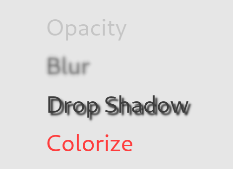
Each effect style has a different set of parameters.
blur:
floatThe blur radius in pixels.See QGraphicsBlurEffect.
drop-shadow:
tuple[float, QColor, QPointF]Example drop-shadow#style = { "drop-shadow": (10.0, QColor("black"), QPointF(-1.0, 5.0)), },
colorize:
tuple[QColor, float]QColor Tint color.
floatThe strength of the colorization.
opacity:
floatThe opacity of the widget.
Note
Due to limitations in the Qt API, only one graphic effect can be applied to a Base Element at a time.
Size Policy#
The size_policy prop of QtWidgetElement is also
sometimes useful for controlling the Qt layout behavior.
Style Merging#
If you want to make all Labels be red but have labels of different
font sizes, you can create a common style dict for shared styles…
LABEL_STYLE = {
    "color": "red"
    "font-size": 12,  # Default font size
    "background-color": "rgba(245, 245, 220, 100)",
}
…and adjust the common style dict with |, the
Python dictionary merge operator.
with VBoxView():
    Label("foo", style=LABEL_STYLE | {"font-size": 16})
    Label("foo", style=LABEL_STYLE)
    Label("foo", style=LABEL_STYLE | {"font-size": 8})
Global Style#
Set global application styles in a root Element
use_memo initializer function.
For more information see App.
If you think that Qt’s default color palette has weird choices, you can try
the Edifice color palettes
palette_edifice_light and
palette_edifice_dark.
See theme_is_light for instructions
on how to use them.